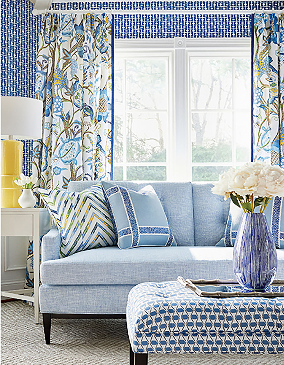
Blue & White, Always Right
- PLC

- Mar 4, 2021
- 2 min read
There are, quite literally, an infinite number of possible color combinations. Some have high contrast. Some are monochromatic or “tone on tone.” Others are complimentary (opposite each other on the color wheel), analogous (next to each other on the wheel), or triadic (three evenly spaced on the wheel.) I like all colors except rust. Love orange and melon but not rust. Also, not fond of forest green. If you had to choose just one combination, what would be your favorite?
Many of you might say blue and white. Even if it isn’t your favorite or wouldn’t use it in your own home, chances are that you would still consider it pretty. Why? It’s classic, fresh and serene. It’s embraced all over the world. I think of Greece with its white stone and blue-domed buildings, or China with its precious blue and white porcelain, or Holland’s popular delft blue.
Here’s an interesting sidenote: While I knew that Greece used volcanic rock to build homes (lumber was scarce) and painted them white to reflect the heat, and while I thought the blue accents were a nod to the surrounding sea, I wasn’t exactly correct. In reality, the dark rock was painted with white lime because it was thought to have antibacterial properties. And, blue was the cheapest color to use. It’s a mixture of water and a blue powder cleaning agent called “loulaki” which was readily available.
No matter the country, blue and white interiors have many advantages. In addition to being classic, fresh and serene, this combo is also seen as a neutral. It has the strength to stand on its own or work with virtually any other color. It’s also not overpowering like red and white, yellow and white, or black and white.
Blue and white is a flexible color combination as it suits different design styles from formal, traditional homes to casual, beach-y cottages and every aesthetic in between. Keep in mind that the darker the blue, the greater the contrast and the more dramatic the ambience will be. As such, you may want to use lighter shades where you want your mind to rest – a living room where you enjoy relaxing conversation or a bedroom where you sleep, for instance. Royal and navy blues work well in kitchens and home offices. What about powder rooms and bathrooms? I say anything goes but I tend to favor turquoise and white as they remind me of clean, tropical waters.
Why we do like blue and white? Maybe we are inherently drawn to it because of the sky above and the ocean beyond. Maybe it’s a part of our DNA in a sense. In any case, blue and white is always right.

#blueandwhite #blueandwhitealwaysright #blueaesthetic #plcinteriors #thibautdesign #thibautwallpaper #thibautfurniture @plcinteriors
_edited.jpg)


Comments